Back
Redesigned Private Dashboard and Website for Emergency Food & Shelter Program
A complete redesign of the public-facing website and internal dashboard for a government-funded emergency services program - combining a responsive design system with detailed guidelines, administration user flows for volunteer coordinators, and consolidated accessibility improvements.
My Role
Product Designer
Product Type
Me & 2 other people
Team
Saas
Date
Jan 2020 - Feb 2021

Overview
Challenge
The EPSP website and internal dashboard were built on legacy technology that no longer served the organization's evolving needs. The digital experience was outdated, difficult to navigate, and didn't reflect the organization's modern mission and impact.
Solution
Complete website redesign (public-facing)
Internal dashboard redesign (staff and leadership tools)
Comprehensive design system and guidelines.
User flow optimization across all key interactions
Accessibility audit and WCAG 2.1 AA compliance.
Outcome
20%
Staff Productivity
35%
Website Traffic Mobile Users
60%
Task Completion Time
30%
Support Handling Time
Internal Tool
01
What Research I did?
Stakeholder Interviews
Since this was a strategic redesign for a government-funded initiative, I conducted in-depth interviews with key stakeholders to understand their pain points, daily workflows, and success metrics.
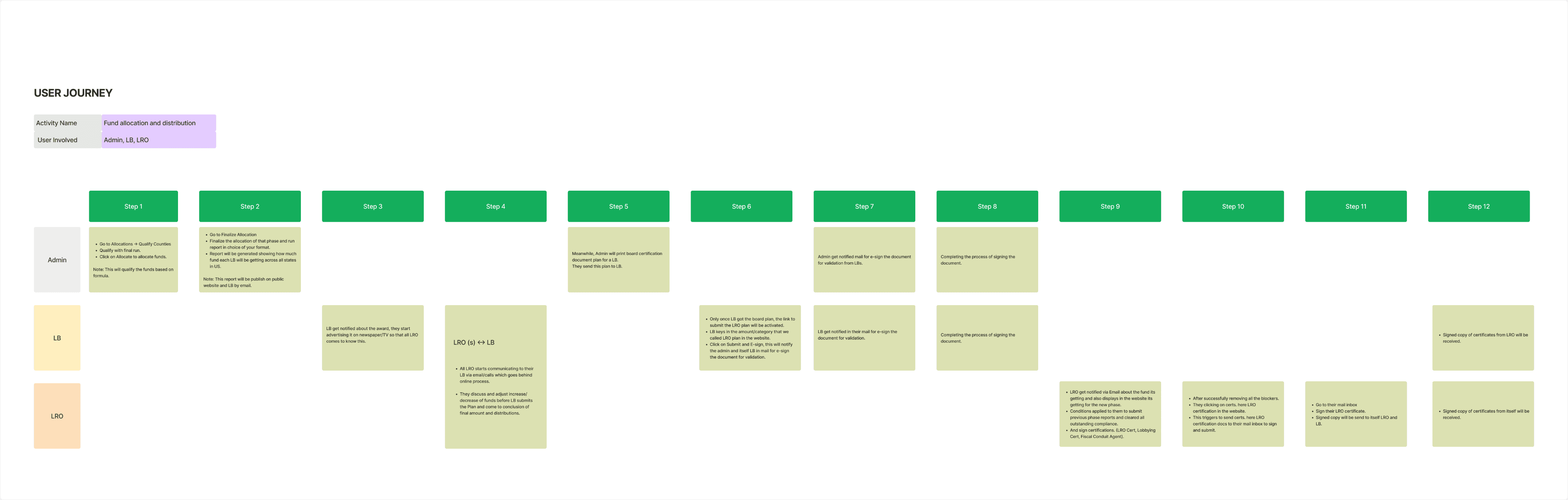
Core User Journey Analysis
I was not clear how these users are interacting with each other, so I leaned on each member journey for fund allocation and distribution, and how the transitions between them happened and at what stage.
I want to understand how the staff work & interact inside the tool to understand there problems.
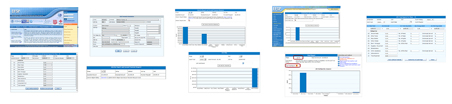
Screening & Auditing of Each Page
There were so many modules inside the tool so I go through module and did a thorough inspection.
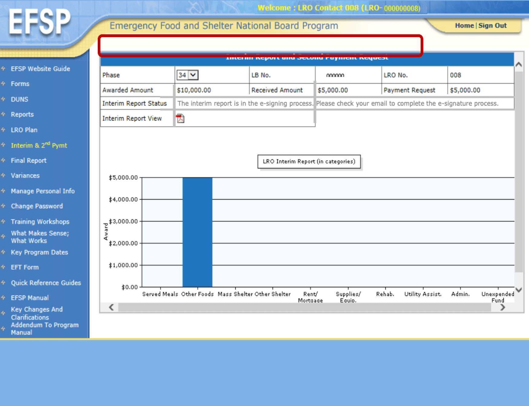
Current Pain Points
Teams struggled with confusing information architecture and unclear navigation paths.
Three issues emerged consistently across all query sessions for each user Admin, LBO and LRO:
1
No actionable data surface
The dashboard didn't provide actionable insights for staff and leadership - reports existed but were buried and unformatted for decision-making.
2
Visual identity disconnect
Visual design didn't align with the organisation's values or mission - internal tool felt like a generic legacy admin panel, not a purpose-built civic tool.
3
Mobile inaccessibility
Developing the mobile experience that enhances accessibility was flagged by field volunteers who primarily used phones during service delivery.
02
Insights I Traced
Navigation was the biggest usability bottleneck
Users looked for key information at fewer than 12 website locations; they only used 3 regularly.
Mobile represented 20% of website visits but had poor user experience
Field workers and applicants were mobile-primary but the tool was built desktop-first with no responsive consideration.
Dashboard overwhelm was universal
Dashboard contained 40+ KPI metrics, leading every stakeholder interviewed to describe feeling "lost" upon login.
Staff wanted faster access to key metrics
Staff wanted better access to key metrics for decision-making - fund allocation, family counts, and org status - without generating manual reports.
03
Define Phase
Design Goals
How do I address the problem statement in my design? A mind-mapping exercise mapped goals to solutions across three dimensions: organisational (what leadership needs), operational (what staff needs), and public (what service recipients need).
The goal was to create a modern, accessible, and scalable digital experience that improved engagement, efficiency, and organizational impact.
Goals
Create a Cohesive Brand Experience
Optimize Operational Efficiency
Enhance Information Findability
Ensure an Accessible Experience
Solutions
Establish a consistent visual language that reflects the organization’s identity and values.
Simplify key workflows for different administrative user groups to reduce friction and improve productivity.
Make content and functionality easier to navigate through a user-centered information architecture.
Ensure all users can effectively access and interact with the platform regardless of ability.
04
Defining the Structure
First I mapped the site and created a sitemap for all kind of users (admin, UBO, LPO) to know the requirements -establishing a shared vocabulary for the information architecture before any screens were drawn.


05
Dashboard Interface
The redesigned internal dashboard consolidated the most critical operational data - fund allocation, application review, and organisational status - into a clear, role-aware interface that worked on both desktop and mobile. Built 60+ screens for dashboard and its modules.
Before
After

LRO Dashboard
[20+ Screens]

LB Dashboard
[40+ Screens]

Style Guideline

06
Deliverables of Internal Tool
01
Dashboard
Role-aware internal tool with fund management, application tracking, and reporting for 3 user types (Admin, LBs, LROs).
02
Design System
Comprehensive component guidelines, token documentation, and usage rules shared across both public and internal surfaces.
Website Revamp
01
The Trigger for Redesign
Three core usability failures were driving users away from the existing public-facing website, identified through a combination of analytics review and heuristic evaluation before any new design work began.

Unclear Navigation
The tab structure gave no clear sense of options - some options were redundant or irrelevant to the actual service users.

Poor Information Hierarchy
Too much data was presented on the same page, giving irrelevant and user information across all key interactions.
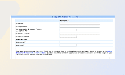
Broken User Flow
Critical access like this file were absent, leaving users without a clear path to complete essential service tasks.
02
Brand & Customer Research
Before visual design, a brand audit was conducted alongside stakeholder interviews with program administrators, volunteers, and service recipients. The goal was to understand what the organisation needed to communicate and to whom before redesigning any surface.
Metropolis - Body + UI

03
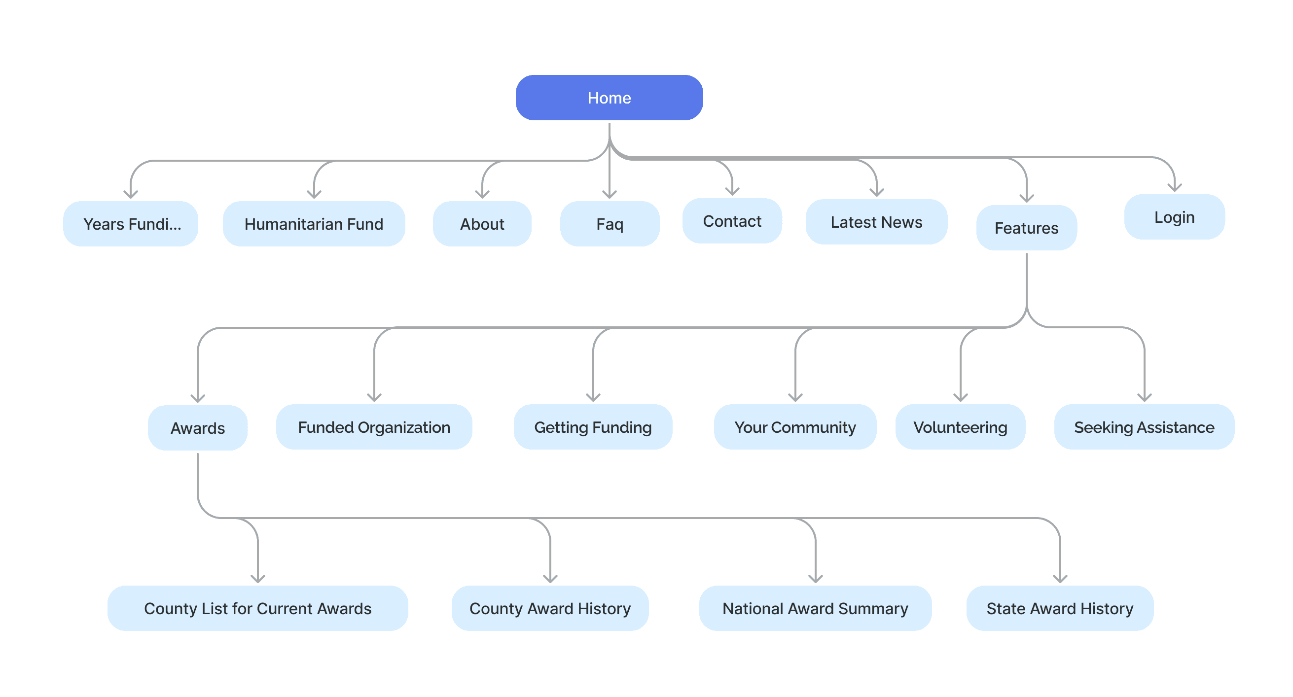
Sitemap
Mapped the new information architecture, consolidating the previous navigation from 9 inconsistent sections to 4 clear primary paths, each tied to a distinct user type (public visitors, applicants, volunteers, administrators).
04
Design Phase
Three stages of visual design, each reviewed with stakeholders before progressing to the next level of fidelity.
Before

After

Desktop, Tablet & Mobile versions.

Components

Style Guideline

05
Deliverables of Website
01
Responsive Website
Full public-facing site with mobile-first layouts, accessible components, and a consistent design language.
02
Component Library
Figma design system with reusable components, colour and typography guidelines for future scaling.
03
Accessibility Report
WCAG 2.1 AA audit covering contrast ratios, focus states, ARIA labels, and keyboard navigation.
Wrap-up
What This Project Taught Me
"Designing for government means designing for the people who can least afford a confusing experience."
The EFSP redesign reinforced that accessibility, clarity, and speed of comprehension are not nice-to-haves in civic design, they are the core function.
1
Stakeholder alignment before any pixel
For a government tool, design decisions require organisational buy-in. Spending time on shared definitions before designing saved multiple revision cycles.
2
Internal tools deserve the same design rigour as public products
The staff dashboard serves people who use it 40 hours a week. A confusing internal tool creates ripple effects that reach the people it was built to serve.
3
Accessibility is not a phase — it's a filter
Running accessibility checks at the component level (not at the end of the project) saved significant rework and produced a more coherent visual system.
4
Dual-surface design requires one shared language
Building the website and internal tool in parallel forced a design system that could speak to both public audiences and operational users — which ultimately made both stronger.
Continue seeing my work…

