Back
End-to-End Redesign of a Video Analytics Platform
Vidooly is a B2B video analytics platform serving online video publishers, advertisers, media companies, and agencies. By 2021 the product tracked 15M+ content creators, 500M+ audiences, and measured 2B+ videos across platforms. But the interface hadn't kept pace with the data it was managing.
My Role
Product Designer
Product Type
Video Analytics ~ B2B
Scope
Website + Dashboard
Date
Jan 2020 - Feb 2021

02
Overview
The Platform
Vidooly's product suite spanned six distinct modules: Leaderboard, Brand Intelligence, eSports Analytics, Brand Safety, Creator Dashboard, and Multi-Channel Network (MCN) Suite. Each module had evolved independently, creating a fractured interface language that confused both new users and existing clients navigating between tools.
The Core Problem
The Creator Dashboard - the most used module was drowning in data. Tables with 20+ columns, no visual hierarchy, no prioritisation. Content creators couldn't answer basic questions about their channel without hunting through noise.
"I open the dashboard and I don't know where to look first. There's too much information and none of it feels urgent."
— Creator Dashboard user, Discovery interview
Brief
Redesign the marketing website end-to-end, modernise each product module's UI, and rebuild the Creator Analytics Dashboard with data-informed information architecture, prioritising the metrics that actually drive creator decisions.
Website revamp
Data driven design
Dashboard rebuild
01
Research & Discovery
Before I jump to anything, I needed to understand the analytical tool and how creators using it for which I had a thorough discussion with my team member.
Purpose of Website?
How each Product Suit works?
How many modules?
What is the experience of analytical dashboard?
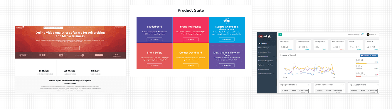
Working with Data Analytics Team
I was instructed that I have redesigned this dashboard analysing the UX part for which I to connect with the data analytics team to understand which metrics creators actually acted on and which ones were noise. This collaboration became the foundation of the entire dashboard architecture.
Partnered with the analytics team to understand key business metrics, user engagement patterns, and areas impacting product performance.
Analyzed behavioral data across core workflows to identify drop-off points, feature adoption trends, and opportunities for UX improvement.
User Research, Creators Experience
Conducted creator interviews and journey mapping exercises to understand goals, decision-making processes, and pain points across the platform.
Leveraged session recordings, heatmaps, and user behavior analytics to uncover navigation challenges, engagement patterns, and friction points in critical workflows.
Took me more than 2min to find "top performing video this month" - On call with creator
Website Audit, Marketing Pages
Collaborated with the marketing team to evaluate website performance, messaging hierarchy, and conversion-focused user journeys.
Audited 20+ pages to identify usability issues, content gaps, and opportunities to improve feature discoverability and call-to-action effectiveness.
The CTA appeared only once above the fold with no reinforcement after the 3-section scroll.
Competitive Benchmarking
Analysed Creator Studio (YouTube), Tubular Labs, and Social Blade for dashboard conventions that creators had already internalised.
Every major analytics tool led with a KPI summary row, Vidooly buried it inside a table.
02
Decisions before Reshaping the Dashboard
Before — Original Vidooly Channel Page

No visual hierarchy.
Live stats, compare channel and similar all sit in identically sized cards - the most important metric looks the same as the least important.
Platform data is scattered.
YT, FB, Twitter, Instagram each get their own isolated box with no shared reading order or comparison context.
No daily action signal.
The "Last 30 Days" sidebar has the most useful numbers but it's the smallest, most tucked-away element on the page.
The dashboard's biggest flaw was that it treated all 60+ metrics as equal. I need to find out answer of one question: ”Do creators look for this regularly?" and Do creators act on this?" That will what shaped the entire dashboard hierarchy.
What I understood from analytics data
Out of 60+ metrics, only 8 caused creators to actually change their content strategy after seeing them.
52 reference metrics, useful for deep dives but don't drive decisions on their own. Have equal visual prominence.
Creators couldn't answer "is my channel growing?" without hunting.
What decision framework I agreed on
3-tier information hierarchy for the redesign
P1 - Visible at top. Acts on it + checks it regularly.

P2 - Visible on scroll. Checks often.

P3 - Useful for deep dives, not daily need.

04
Key Decisions
Public Website
Unified 3-column product card grid with consistent size, icon, and single standardised CTA per card
Stat counters (15M+ creators, 500M+ audiences, 2B+ videos) repositioned above the product suite for instant credibility
Single action per card, "Learn More" reducing decision paralysis and establishing visual rhythm
Creator Analytics Dashboard
New KPI hero row - 5 P1 (Top Priority) metrics surfaced at the very top
3-tier metric architecture: Hero → Secondary → Drill-down based on analytics team collaboration
Every metric shows 28-day delta (↑/↓ with %) and a 7-day miniature trend line in the same cell
03
My Design Process
The goal was to create a modern, accessible, and scalable digital experience that improved engagement, efficiency, and organizational impact.

1.
Discovery Sprint, Dual Track
Ran two parallel tracks: stakeholder interviews with the product and analytics teams to understand business goals.
Built a journey map from the creator's perspective, from opening the dashboard to making a content decision.

2.
Information Architecture Rebuild
Used a framework to define a 3-tier information hierarchy for the dashboard.
After getting the validation, the visual design process starts.

3.
Website Interface Redesign
Redesigned the marketing website homepage and all six product module landing pages.
Key decisions: moved social proof (client logos + 3 stat counters) above the product suite section, unified the product card grid with consistent colour, size, and CTA hierarchy, and rebuilt the mobile layouts from scratch. The contact form at the bottom was restructured from a 6-field flat form into a 2-step progressive flow.

4.
Creator Dashboard Interface
Designed the new Creator Dashboard with the 3-tier metric hierarchy as the skeleton.
Turn dense, overwhelming data into clear, actionable insights through better visual hierarchy and information design.

5.
Usability Testing & Iteration
Ran moderated usability tests on a high-fidelity Figma prototype with team members.
The dashboard went through 3 rounds of iteration before arriving at the final, fourth version.

6.
Developer Handoff
Delivered all screens, a design guideline, and a basic token set (colour, spacing, typography) so the engineering team could implement consistently across modules.
Stayed in daily sync with the front-end team during the first two weeks of implementation.
05
Redesigned Marketing Website - Full Prototype
Every section of the marketing site was rebuilt with a clear rationale. Below is the interactive prototype, click through the tabs to see each page section and the design decisions behind it.
Before

After

06
Redesigned Creator’s Dashboard Interface
Every element in the new dashboard traces back to the metric priority matrix and user research. The design hierarchy is not visual preference, it's a direct translation of creator decision-making patterns. Full Dashboard
Before

After

07
Outcome
4.1/5
Dashboard Usability Score
Post-launch usability rating from 20 creator users, up from 2.1/5 pre-redesign. "Easy to understand at a glance" was the most improved dimension.
41%
Website Inbound Demo Requests
Repositioning social proof above the product suite and adding mid-page CTAs drove a 41% lift in demo request form submissions from the marketing site.
+34%
Dashboard Daily Active Usage
DAU on the Creator Dashboard increased 34% within 6 weeks of launch. Users who previously checked weekly began checking daily due to the quicker value discovery.
62%
Support Tickets, dropped "Can't find X"
Navigation confusion tickets dropped 62% as promoted demographics panel and clearer module navigation eliminated the most common "where is this data" queries.
08
Here's What I Learn
1
Design with Data Analysts
Before starting any design work, I learned to first audit the existing product to understand patterns, inconsistencies, and constraints. 2 week of auditing helped ensure solutions were grounded in real system behaviour rather than assumptions.
2
How KPI is not a feature but answer
I understood that validation rules directly impact user experience, how it help to reduce friction.
3
Website and Product Are One Experience
I realized that good documentation defines how the system is used and scaled. It reduces ambiguity for both designers and developers while ensuring consistency.
Continue seeing my work…

