Back
Scaling Enterprise Operations with a Unified Design System for Barrel Fuel
A component-first design system built to unify dashboards, data tables, and complex forms across a growing product suite.
My Role
Product Designer
Domains
Dashboard + Forms
Industry
Enterprise · B2B SaaS
Date
Jan 2020 - Feb 2021

01
Challenges
Barrel Fuel internal tool is vast used by many different staff members and clients. Here are all the key challenges:
28 distinct button variants across the product - performing 5 actual functions.
Lack of variants and properties for many key components.
Table broke down due to dense data.
New screens takes time to create.
Validation only triggered on submit, surfacing 10+ errors at once with no recovery path.
Zero mobile consideration - forms and tables broke below 768px viewport width.
Solution
By building the system beneath the product first, I introduced flexible, reusable components that improved consistency, reduced duplication, and streamlined future design work.
02
What Research I did?
Complete Component Audit
The first 2 weeks were spent in audit mode - no new design work. Every screen, every component, every form field across the product was catalogued and classified. The audit produced a UX debt map that became the single source of truth.
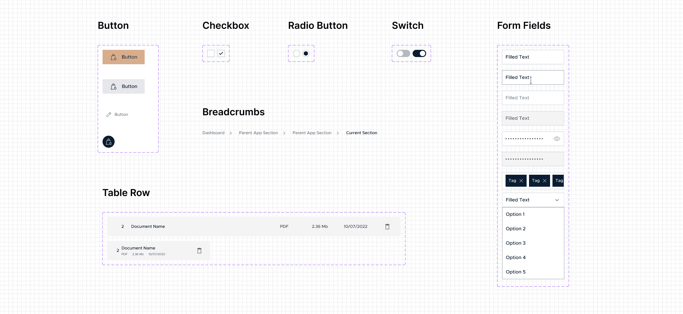
The Old Library - Components that Needed Work
Barrel Fuel has many components in their library but after auditing and in discussion with managers, these are stood out most to be worked on.
Why?- Because there is lack of flexibility in these components and no variants are available.
Apart from redesigning these 7 components along with their many variant, I also created new components.
03
Design Decisions
Here’s what I Found Out
Missing Variants for Key Components, many key components are left emptied without variant which led to inconsistency and lack of scalability. Components like checkbox, radio button, switch, form fields and many more.
The Decisions That Shaped the System
28 Button Variants
5
Team using 28 variants of buttons across the product, conflicting hover states, no disabled pattern
5 semantic variants: Primary, Secondary, Ghost, Icon, Notification Button.
All variants support: default, hover, focus, active, disabled.
14 Form Field Styles
4
14 field styles, inline errors on some, toast errors on others
Max 7 states: default, hover, focus, filled, error, disabled, selected.
Inline validation with human-readable messages on every input
9 Table Implementations
1
9 implementations, broken format, inconsistent
1 composable Table component
8 Inline composable sub-components were newly created to support add more flexibility to table
Optimised for Mobile Responsiveness
Expanded Component Variant Coverage
Limited Variant and Property Support
Added variants to support more use cases.
Introduced properties for easier customisation and adaptability.
04
What I Built?
The Foundation
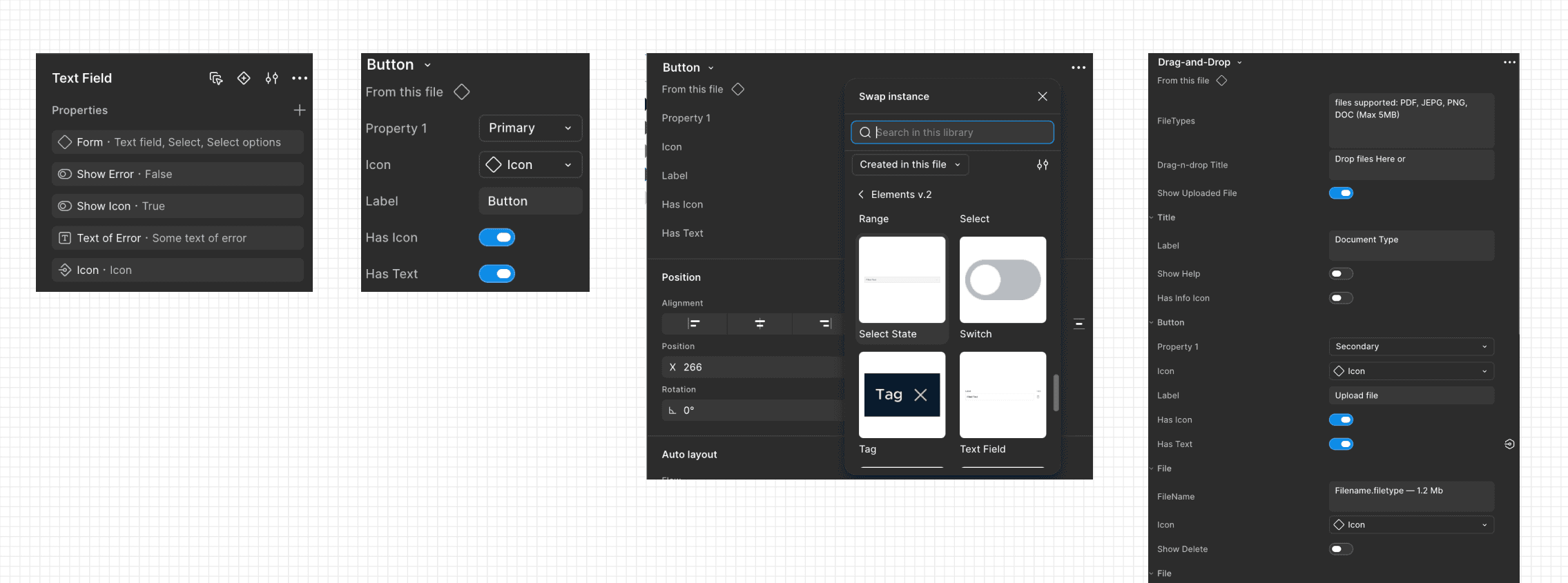
The layout and spacing for Forms and Modals has been defined. And the anatomy for for text fields has also be structured which brought the flexibility to forms fields.

The Components Redesigned

The Components Newly Created

Introduced Flexibility
05
Outcome & Metrics
Here’s what changed…
01
Forms & Tables now Responsive
Now the long and complex forms and table can be access through mobile.
02
Scalable System
From being rigid to scalable system that supports complex the growing complexity in the tool.
03
New Screen Dev
Teams could finally find and reuse existing components, resulting in 80% adoption &
3x faster in new screen development.
04
Visually Consistent
Tool become more consistent visually even when multiple people from team contributing.
06
Here's What I Learn
1
Audit before design. Always.
Before starting any design work, I learned to first audit the existing product to understand patterns, inconsistencies, and constraints. 2 week of auditing helped ensure solutions were grounded in real system behaviour rather than assumptions.
2
Form validation is a UX decision, not a dev one.
I understood that validation rules directly impact user experience, how it help to reduce friction.
3
Documentation is the product.
I realized that good documentation defines how the system is used and scaled. It reduces ambiguity for both designers and developers while ensuring consistency.
4
The Invisible Architecture
Visuals are easy. The real work is the unglamorous architecture - naming, nesting, and properties, that makes components scalable and handoff-ready.
Continue seeing my work…

